Overview
Text can make an image clearer, but it can also make a good image feel noisy. The best text overlays are short, readable, and placed where the background supports them.
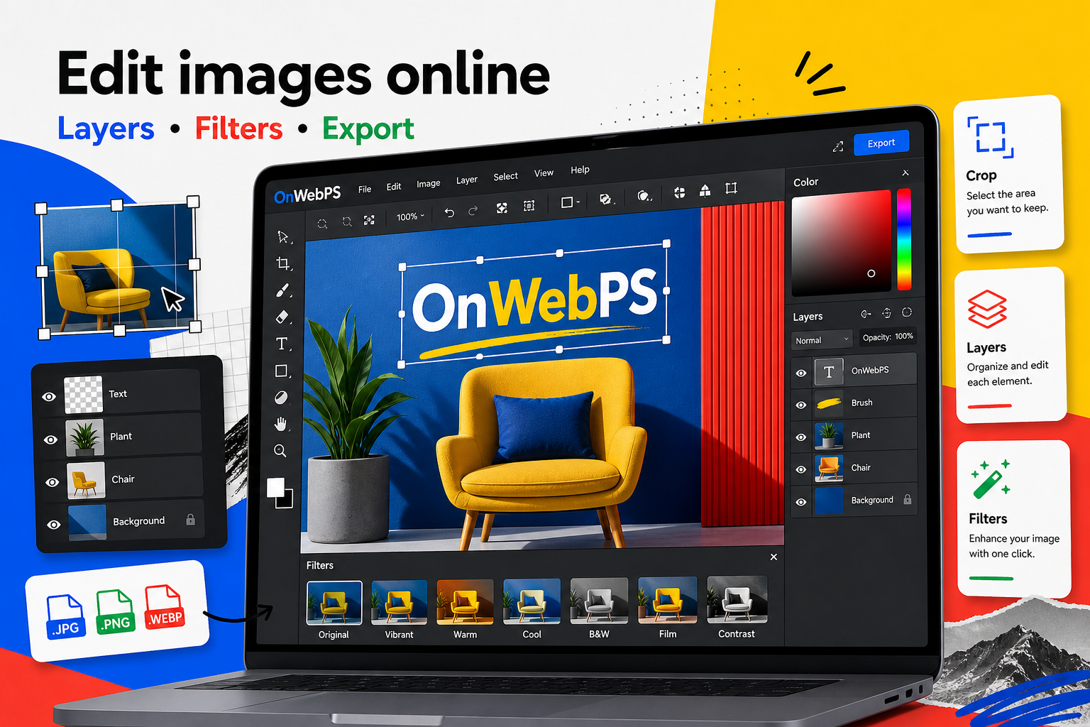
Use a copy of important images, keep reusable elements on separate layers, and decide the final destination before choosing crop, size, and export format.

Write less than you think
A thumbnail or poster image should not carry a full paragraph. Use a headline, a short label, or a date. Move longer explanations into the page text where readers have room to understand them.
In OnWebPS, keep the workflow practical: work on a duplicate when the change is risky, compare the edited result with the original, and export only after checking the image at the size where people will actually see it.
Create contrast
Text needs clear separation from the background. Use light text on dark areas, dark text on light areas, or place a simple shape behind the words. Lower the shape opacity if you want the photo to remain visible.
In OnWebPS, keep the workflow practical: work on a duplicate when the change is risky, compare the edited result with the original, and export only after checking the image at the size where people will actually see it.
Respect the subject
Do not cover faces, products, important labels, or key tutorial details. If the photo has no empty space, crop wider or create a reserved text area with a shape layer. Good text placement feels intentional rather than squeezed in.
In OnWebPS, keep the workflow practical: work on a duplicate when the change is risky, compare the edited result with the original, and export only after checking the image at the size where people will actually see it.
Limit styles
One headline style and one small label style are enough for most designs. Too many fonts, colors, outlines, and shadows make the image harder to trust. If you need emphasis, change weight or size before adding more effects.
In OnWebPS, keep the workflow practical: work on a duplicate when the change is risky, compare the edited result with the original, and export only after checking the image at the size where people will actually see it.
Check mobile readability
Zoom out and view the design at a small size. If the words disappear, shorten the copy or improve contrast. Making every word larger is not always the solution because large text can crowd the subject.
In OnWebPS, keep the workflow practical: work on a duplicate when the change is risky, compare the edited result with the original, and export only after checking the image at the size where people will actually see it.
Concrete example
Example project: a workshop poster
Use a photo as the background, add a dark translucent band at the bottom, place the workshop title on the band, and add the date as a small label. This keeps the image readable while leaving the photo visible enough to create mood.
Common mistake
Common mistake: putting text over detailed areas
Text on leaves, hair, product texture, or busy screenshots becomes hard to read. Move it to empty space or add a simple background shape.
Practical FAQ
How much text should an image contain?
Use the shortest text that explains the image. Put detailed explanation in the article body, not inside the graphic.
Final checklist
- Keep copy short.
- Place text on its own layer.
- Avoid covering faces and products.
- Use simple contrast methods.
- Test readability at thumbnail size.
This guide is intentionally practical: repeat the same steps on a real image, compare the before and after result, and keep the version that communicates the task most clearly.