Overview
A strong thumbnail needs one clear idea. It should still work when it appears small in a feed. That means a focused crop, a readable headline, and enough contrast between the subject and the message.
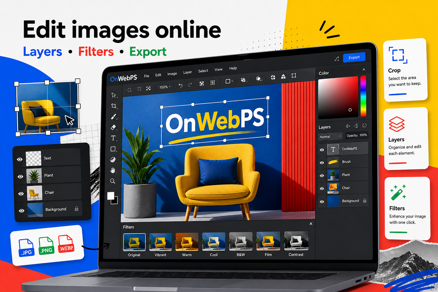
Use a copy of important images, keep reusable elements on separate layers, and decide the final destination before choosing crop, size, and export format.

Pick one subject
Choose the part of the photo that carries the story. If there are many objects, crop toward the most important one. A thumbnail with one clear subject usually performs better than an image full of equal details.
In OnWebPS, keep the workflow practical: work on a duplicate when the change is risky, compare the edited result with the original, and export only after checking the image at the size where people will actually see it.
Create a readable area
Add a dark or light overlay where the headline will sit. Keep it simple: a rectangle, band, or soft shape is enough. Lower opacity so the image still feels photographic.
In OnWebPS, keep the workflow practical: work on a duplicate when the change is risky, compare the edited result with the original, and export only after checking the image at the size where people will actually see it.
Write a short headline
Use three to seven words when possible. A thumbnail is not the article. It is an invitation to read. Save detailed explanation for the page body.
In OnWebPS, keep the workflow practical: work on a duplicate when the change is risky, compare the edited result with the original, and export only after checking the image at the size where people will actually see it.
Add one accent color
Use a small shape, underline, label, or corner tag to connect the thumbnail with your brand or article category. One accent is cleaner than many competing decorations.
In OnWebPS, keep the workflow practical: work on a duplicate when the change is risky, compare the edited result with the original, and export only after checking the image at the size where people will actually see it.
Export for feeds
Export WebP or JPG at a size that matches the platform preview. Check the image at small scale before publishing. If the headline is hard to read, simplify it rather than adding more effects.
In OnWebPS, keep the workflow practical: work on a duplicate when the change is risky, compare the edited result with the original, and export only after checking the image at the size where people will actually see it.
Concrete example
Example project: turning a food photo into a post thumbnail
Crop the dish close enough to feel appetizing, add a short headline in a quiet corner, place a small category label, and export a feed-sized JPG or WebP. The thumbnail should still read clearly when reduced.
Common mistake
Common mistake: trying to explain the whole article in the thumbnail
A crowded thumbnail loses impact. Use the image to attract attention and let the article text explain the details.
Practical FAQ
What should be largest in a thumbnail?
The subject or the headline, not both equally. Choose one primary focus and make the rest support it.
Final checklist
- Focus on one subject.
- Reserve a clean text area.
- Use a short headline.
- Limit accent colors.
- Preview at feed size.
This guide is intentionally practical: repeat the same steps on a real image, compare the before and after result, and keep the version that communicates the task most clearly.